I was taking in the splendor of old Hollywood yesterday, and more specifically the Mediterranean-style Crescent Drive mansion where Columbia Pictures chief Harry Cohn lived from 1946 until his death in ’58. I swear to God I felt Harry hovering nearby, or at least a spectral remnant. “Who the hell are you?” Cohn’s ghost said. “I’m Jeffrey Wells, samurai poet columnist,” I replied, “and one of the few guys in this town who remembers you and even mentions you from time to time so show a little respect.” The ectoplasmic Cohn grumbled as he floated away, heading for the pool area.
All my life I’ve read that Cohn was a crass, tyrannical bully-boss, grudgingly “respected” but feared and most certainly despised. Screenwriter Ben Hecht famously referred to him as “White Fang.” Like other studio chiefs of his day Cohn had a quid pro quo relationship with mob guys, was something of a racist thug (“The Kid in the Middle“, a BBC doc, reports that Cohn had goons threaten Sammy Davis, Jr. over his relationship with Kim Novak), reportedly hastened the death of poor Curly Howard (the woo-woo guy with The Three Stooges) and of course was always trying to fuck the hottest actresses.
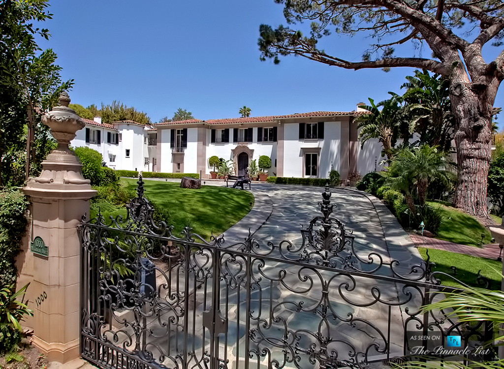
Harry Cohn lived here (1000 No. Crescent Drive in Beverly Hills) between 1946 and ’58.
Nobody out-Cohned Cohn. Read Bob Thomas‘s “King Cohn” when you get a chance. Cohn was the model for The Godfather studio chief Jack Woltz (the horse’s head incident never happened but Frank Sinatra almost certainly pleaded for the Pvt. Maggio role during a visit to Cohn’s home). Legend has it he was also the inspiration for Broderick Crawford‘s thick-fingered sugar daddy in Born Yesterday.
But Orson Welles respected Cohn’s dogged gambler instinct [see above], and unlike today’s soul-less corporate lackey studio heads, at least Cohn had movies in his blood. Okay, he could be a prick and yes, he was dead wrong for strongly preferring Aldo Ray to play Pvt. Robert E. Lee Prewitt in From Here To Eternity instead of Montgomery Clift, but you can’t be entirely dismissive of a roster that included It Happened One Night, Lost Horizon, Holiday, Only Angels Have Wings, The Lady From Shanghai, All The King’s Men, Born Yesterday, From Here to Eternity, On The Waterfront, The Caine Mutiny, Picnic, The Bridge on the River Kwai and Hell Cats of the Navy.

