

William H. Clothier's framings of John Ford's The Horse Soldiers ('59) are so visually pleasing...so wonderfully balanced and lighted, not to mention staged and edited to a fare-thee-well. First-rate filmmaking from an old-time era when 1.66 was still a celebrated aspect ratio.
Login with Patreon to view this post
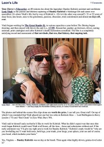
As one who knew and even hung a couple of times with Leon Vitali, the former actor and devoted Stanley Kubrick associate throughout the ’70s, 80s and’ 90s, and as one who badgered him a few times during the Barry Lyndon aspect-ratio brouhaha of 2011, I’m very sorry to hear that he’s passed.
I loved Filmworker, Tony Zierra‘s 2017 documentary about Leon and his historic life. I’ll probably watch it again tonight.
Leon was a fine fellow and a true believer. He understood hardcore devotion as well as anyone I’ve ever known in this racket has.
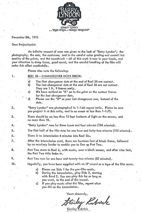
Longtime HE readers will recall the Barry Lyndon aspect ratio contretemps, which ranged between 5.23.11 and 6.21.11. Retained by Warner Home Video as a technical consultant on a spate of Kubrick Blurays, Vitali insisted that the WHV Lyndon Bluray be issued at 1.77:1 rather than 1.66:1, an a.r. previously adopted when WHV released the 1975 classic on laser disc.
I hit the roof when I read about this. I argued, howled, seethed.
Then Glenn Kenny posted a 12.8.75 “smoking gun” letter, leaked by Jay Cocks and written by Kubrick and sent to U.S. exhibitors. It stated that Barry Lyndon had been shot in 1.66 and should ideally be projected this way.
The Lyndon debate was of the most bitterly fought and not incidentally triumphant a.r. battles in Hollywood Elsewhere history, the other being the Shane a.r. battle of 2013.
On 7.19 Kino Lorber will issue a 4K “special edition” Bluray of Delbert Mann‘s Marty (’55). It will include the correctly framed 1.37 version, which Kino issued in 2014, along with an 1.85 version — a political concession to the 1.85 fascists who screamed bloody murder over the boxy.
In a 7.28.14 HE post titled “Marty Is Boxy After All…Glorious!,” I included an explanation from Kino Lorber vp acquisitions and business affairs Frank Tarzi:
“We looked at [Bob Furmanek]’s research and then screened Marty at 1.85, and didn’t like what we saw,” he said. “If I cropped some of the close-up scenes down to 1.85 I would be cropping half of their face off. I could see [going with] 1.66 but I still think 1.33 is better. We got attacked on Home Theatre Forum and Facebook. I couldn’t believe the tone of [some of the posts]. For a two-week period we were being crucified.”
Tarzi says he’s “very happy” with the boxy Marty. “1.85 just would have been too severe, he believes. “We did several tests. There’s one closeup scene in which Marty’s is on the phone, asking the girl for a date…by the time the camera stops getting in tight, the face covers the whole frame. Cutting that down to 1.85 would have been incorrect.”

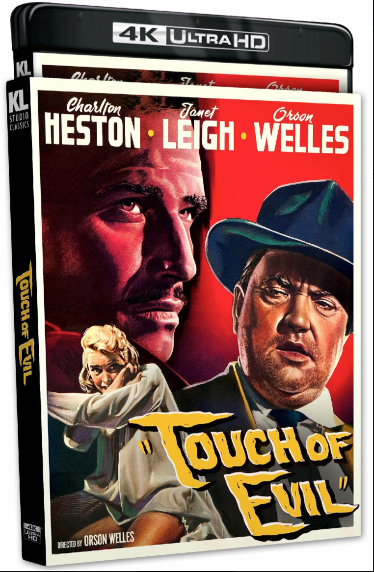
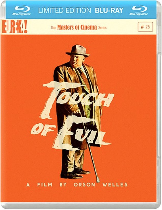
HE to Kino Video regarding upcoming Touch of Evil 4K Bluray (streeting on 2.22.22): As you guys presumably recall, England’s Masters of Cinema / Eureka Video released two versions of a Touch of Evil Bluray in two aspect ratios — 1.85 and 1.37 — roughly a decade ago.
A Kino Lorber spokesperson has confirmed that their forthcoming 4K version will be formatted only in 1.85.
In November 2011 Eureka Video released a Bluray of Orson Welles‘ Touch of Evil (1958) with five different versions of the film.
We’re actually talking three versions of the film, two of which are presented in both 1.37 and 1.85 aspect ratios and one (the 1958 pre-release version) presented in 1.85 only. The 1998 reconstructed version, running 112 minutes, that was put together by Walter Murch, Bob O’Neil and Bill Varney, is presented in 1.37 and 1.85.
Two aspect ratios for both versions is so hardcore, so film-nerdy…your heart goes out to people with this much devotion.
But the orange jacket-cover backdrop is, for me, a problem. To advertise a revered classic film taking place in a Mexican border town and shot in the gritty environs of Venice, California, Eureka chose one of the most needlessly intense and eye-sore-ish colors in the spectrum? A color that says traffic cones and prison jump suits?
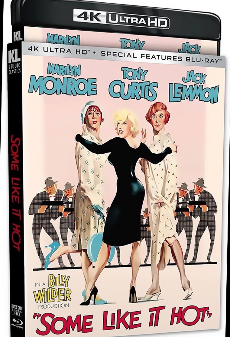
I’ve mentioned this minor point before, but HE continues to regret Kino Lorber’s decision not to re-think the aspect ratio of its forthcoming 4K UHD version of Some Like It Hot. This will be the first time that Billy Wilder’s 1959 classic has been released in this format (3840p x 2160p). Standard Bluray resolution is 1920p x1080p, of course.
The Kino transfer will be the same beautiful version that Criterion released in November 2018, complete with their perverse decision to needlessly and nihilistically slice off the tops and bottoms of the SLIH image, which has been 1.66 since the beginning of time.
Before the handsome Criterion Bluray version came along the entire civilized world had agreed that Some Like It Hot is a 1.66 film. That included Kino Lorber itself, which released a Some Like It Hot Bluray with a 1.66:1 a.r. in May 2011.

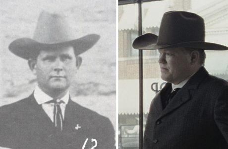 All Hail Tom White, Taciturn Hero of “Killers of the Flower Moon”
Roughly two months ago a very early draft of Eric Roth‘s screenplay for Killers of the Flower Moon (dated 2.20.17,...
More »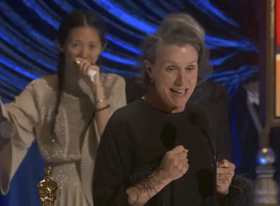 Dead-End Insanity of “Nomadland”
Frances McDormand‘s Fern was strong but mule-stubborn and at the end of the day self-destructive, and this stunted psychology led...
More »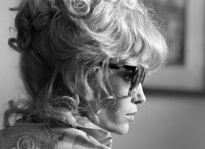 Mia Farrow’s Best Performances?
Can’t decide which performance is better, although I’ve always leaned toward Tina Vitale, her cynical New Jersey moll behind the...
More »

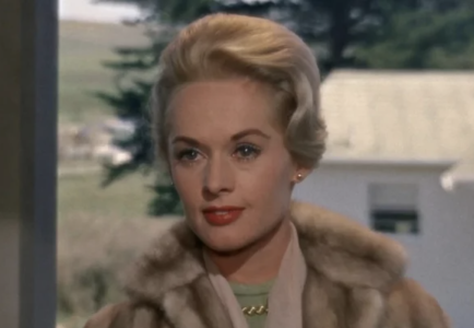 Hedren’s 94th
Two days ago (1.19) a Facebook tribute congratulated Tippi Hedren for having reached her 94th year (blow out the candles!)...
More »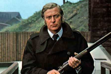 Criminal Protagonists
A friend suggested a list of the Ten Best American Crime Flicks of the ‘70s. By which he meant films...
More »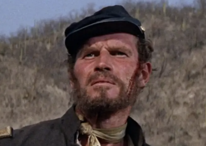 “‘Moby-Dick’ on Horseback”
I’ve never been able to give myself over to Sam Peckinpah’s Major Dundee, a 1965 Civil War–era western, and I’ve...
More »