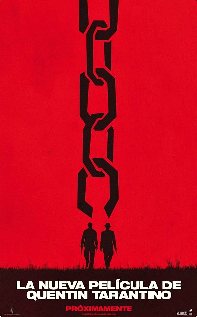
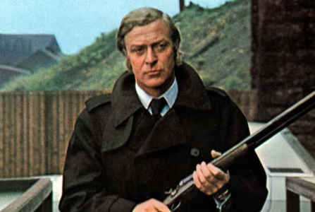
The designer of this Spanish teaser poster for Quentin Tarantino‘s Django Unchanged was obviously going for a Saul Bass effect. But using a chain as the primary image is so literal. It’s almost like showing two silhouetted figures with one saying to the other in a dialogue balloon, “Hey, Django…how’d you break free?”
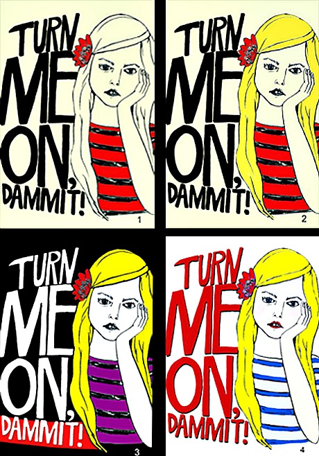
Here are four non-finalized versions of Reid Rosefelt‘s one-sheet for Turn Me On Dammit! (New Yorker, 3.30). He’s asking HE readers to rate them in order of preference plus offer up any comments that might occur. The line illustration is by Kelly Lasserre. Three of the color treatments are by Ron Ramsland of New Yorker Films; one is by Rosefelt.
“As you can see the poster is not in any stretch of the imagination in Saul Bass territory,” Rosefelt writes. “Along the way I had to make compromises and one of them was that the girl in the ad had to resemble Helene Bergsholm, the star of the film.
I have bigger individual versions which I’ll post later.
“It might seem strange that a film featuring a fairly gratuitous moment of, uh, (brief) full frontal nudity when considering its most essential plot point is a male counterpart of our 15 year old female protagonist taking out his, uh, ‘dick’ and pointing it at her is more subtle, thoughtful and genuine than just about any teen sex comedy of any nationality with no (brief) full frontal nudity of any kind that I’ve come across but that’s the truth. It’s one of the best films of 2011.
“It’s not unlike Mean Girls in the way that it displays how quickly and brutally these high-schooled aged ladies can turn against one another and how one little white lie can transform a life. What it doesn’t do, though, is make these rather harsh story complications an excuse for comedic setpieces and exaggerated characters. There is funny to be seen and heard, to be sure, plenty of it, but what could have been crass is just honest.”
Indiewire‘s Anne Thompsonposted earlier today about the return of New Yorker Films with the forthcoming release of Jannicke Systad Jacobsen‘s Turn Me On, Dammit!, a Norwegian teenage sex comedy which won the Best Screenplay Award when it played at last spring’s Tribeca Film Festival. But there’s a holiday hitch, I soon found out.
Seconds after reading Thompson’s piece I wrote marketing exec Reid Rosefelt, who’d urged her to write about Jacobsen’s film. “When can I see it in Los Angeles?,” I asked. “And where’s that Saul Bass-styled release poster that Anne mentioned?”
An L.A.-based publicist will be screening it, he said, but not for a while. He said he’d get back to me about sending a screener. “Everybody’s off work but me,” Rosefelt explained.
“And the Saul Bass-inspired poster isn’t finished yet,” he added. “But it should be soon and I’ll get it to you as soon as it is. I’ve been through many drafts with the illustrator I chose. I started out in the business as a graphic designer, and it is fun to be back to that.”
“Sounds good and looking forward,” I replied, “but if there are no LA screenings or screeners for now and not even poster art to post on the web, why did Thompson even write about it? It would help to be able to see this during the holidays, when I’m always going out of my mind with nothing to do.”
Rosefelt explained that he’d pitched a story on the return of New Yorker Films, and Thompson, being a good egg and an old friend, was willing to help at an early and busy time.
“‘Looking forward’…exactly,” he wrote. “It’s always a rough road for movies like this and I am looking to plant seeds. Maybe somebody will watch the clip, like it and then respond favorably when a screening invite comes later on. Happy New Year.”
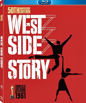
I’ve learned three or four things since posting last Saturday’s story about that uttterly ridiculous fade-to-black mistake contained within the overture sequence in the forthcoming West Side Story Bluray, which will street on 11.15. The error was spotted last week in the British Bluray, which came out on 10.17. It was discussed at length on Home Theatre Forum starting last Friday or thereabouts.
Here’s what I’ve been told so far:
1. Fox Home Video is the distributor of the West Side Story Bluray but it had nothing to do with this recent high-def mastering of this 1961 film. That was the responsibility of MGM Home Entertainment, which owns the rights and handled the mastering and authoring, etc. Update: I’ve since been told that the compression & authoring of the Bluray/DVD was done by Fox Home Video.
2. I’m told that Fox Home Video knows about the issue but will not recall the title. it will instead implement what’s being called a “running fix.” This means that if anyone wants to send their West Side Story Bluray back Fox Home Video will accept it and send them a corrected disc down the road. “We are looking to fix the issue on future discs,” is what I was told.
3. MGM Home Entertainment senior vp publicity Michael Brown declined to respond to calls and emails, but one person at that company who is at least partially responsible for the error is Yvonne Medrano, vp technical services. She also declined to respond to calls and emails. I explained to her and to Brown what I understood to be the history of the situation and asked if they could illuminate further or explain any errors or misunderstandings. Silencio.
4. As I understand it, the high-def scanning of West Side Story was done by HTV Illuminate CEO Jim Hardy. Update: In the comments section restoration guru Robert Harris has stated a belief that the fade-to-black problem happened during the high-def scanning phase, indicating that Hardy is the likely culprit. Here are some recent comments that Harris posted on HTF.
5. Mistakes happen, of course, but it’s mind-blowing to consider that each and every MGM Home Entertainment staffer who was involved in the delivery of the West Side Story Bluray didn’t catch the error. It was a matter of simple ignorance, and not just on the part of Ms. Medrano. No one who looked at it before sending to the duplication plant knew that the overture isn’t supposed to fade to black at any point…ever.
This is what happens when you let monkeys run the factory.
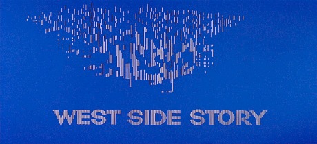
Here’s how HTF member Adrian Turnerdescribed the problem last weekend. “There is a complete fade-to-black [during the overture] just before the pull-out to reveal the main title,” he writes.
“The overture plays from the start as it should do and the Bluray image is very sharp. At the climax of the overture, the moment when the music changes tempo and the color should switch to blue and the zoom-out, there is a quick fade to black.
“And then we get the final section of the music and the blue image. This image is very fuzzy indeed and then it clears and becomes sharp with the zoom-out to reveal the title WEST SIDE STORY. The dissolve from the Saul Bass design to the live shot of New York is just as it should be.
“I don’t know why [the parties responsible] have chosen to alter the film and have ruined this most dramatic moment. It’s a total travesty.”
Doofuses might argue that it’s a relatively minor boo-boo in the greater scheme, but it’s one hell of a mistake in the eyes of film buffs, the Movie Godz and anyone who cares about representing the intentions of the filmmakers. I ordered the British West Side Story Bluray immediately when I heard about this to see if it’s true. If it is, this snafu may be cause for a recall and re-mastering, at least as far as the domestic version is concerned.
To hear it from HTF member Adrian Turner, it sounds like a monkey was at the control board when the Bluray was scanned. Fox Home Video will release the West Side Story Bluray domestically on 11.15, but they allegedly had nothing to do with transferring the elements to Bluray, or so I’ve been told.
Turner wrote early this morning that he “was so worried about this tampering with the overture that when my copy arrived ten minutes ago I played the disc immediately, and I’m afraid it’s true. There is a complete fade-to-black [during the overture] just before the pull-out to reveal the main title.
“The overture plays from the start as it should do and the Bluray image is very sharp. At the climax of the overture, the moment when the music changes tempo and the color should switch to blue and the zoom-out, there is a quick fade to black and then we get the final section of the music and the blue image. This image is very fuzzy indeed and then it clears and becomes sharp with the zoom-out to reveal the title WEST SIDE STORY. The dissolve from the Saul Bass design to the live shot of New York is just as it should be.
“I don’t know why [the parties responsible] have chosen to alter the film and have ruined this most dramatic moment. It’s a total travesty and I don’t care what the rest of the Bluray looks and sounds like. I think we have a sort of Gladiator moment here. Fox need to withdraw this disc and re-do it.”
HTF member A. Hollis of New Orleans asks, “What is with all the tampering? The Bluray should be the mother of all answers. [The fault] has to lie with people in charge who knew nothing about what they were working on. Whoever transferred this must have thought it was a typical overture sequence that needed to fade to black before the film begins, but the entire segment needs to be seen unbroken for impact. Damn, they are just so uninformed!”
Question: A couple of days ago DVD Beaver‘s Gary W. Tooze posted a sneak preview of the British West Side Story Bluray. It wasn’t a “review” but you’d think he’d at least mention something as glaring as this…no? He didn’t.
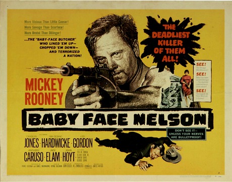
I’ve been saying for years that many Saul Bass one-sheets have seemed “better” than the films they’ve promoted. But Bass doesn’t have a monopoly on this type of thing. One example is the one-sheet for Don Siegel‘s Baby Face Nelson (’57) which, I feel, is more successful as a piece of high-impact design than the film is on its own terms. I don’t think Siegel’s gangster film stinks — it’s good pulpy fun, but the intense poster promises more than Mickey Rooney and Carolyn Jones deliver.
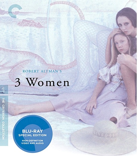
I feel roughly the same way about the poster for Robert Altman‘s 3 Women, which is reflected to some extent in the jacket art for the forthcoming Criterion Bluray. I’ve seen 3 Women only once, but it just doesn’t “do” anything. Sand and windstorms and Sissy Spacek and Janice Rule and Shelley Duvall and empty swimming pools with tiled mosaic floors and gunshots and more windstorms and sand.
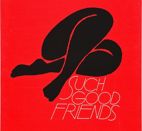
I’ve worshipped the poster for The Man With The Golden Arm all my life, but I’ve only been able to watch Otto Preminger‘s 1955 drama once or twice. Bass’s one-sheet for Preminger’s Such Good Friends (’71) is a more extreme example. The line-drawing artwork is Matisse-like in its simplicity, but the movie is all but unwatchable.
So what other posters are significantly more engrossing or profound or pleasurable or more satisfying on some level than the films they’ve been created to promote?
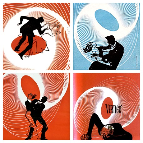
To mark the 15th anniversary of Saul Bass‘s passing, web designer Christian Annyas yesterday posted a Vertigo movie-poster-design page that includes some alternate images that Bass designed but weren’t chosen as the primary. My favorite is the sexier lower-left image, followed by the despairing lower-right.
The upper-left was chosen for the ’58 one-sheet but the hat worn by the male silhouette dates it, obviously. Here’s my 7.16.10 riff on that awful brown suit worn by Vertigo star James Stewart.
The actual art was done by Bass associate Art Goodman. “Bass designed everything, but often other people were involved in the execution of his ideas,” Annyas explains. Here’s a list of Saul Bass/Art Goodman collaborations.
Here’s an article about Bass by Pat Kirkham that’ll be published later this year.
With its 1.33 cropping and squawky Japanese-transistor-radio sound, this YouTube clip of the main-title sequence from Clive Donner‘s What’s New, Pussycat? feels a bit underwhelming. But it’s still one of the liveliest, bounciest and most vigorously designed main-title sequences ever thrown together for a ’60s film.
Two days ago a fan-made, early ’60s-style main title sequence for the forthcoming X Men: First Class (20th Century Fox, 6.3) got 2000 hits. Yesterday it got 40,000 and today (as of 4:30 pm eastern) it’s at 50,000 and counting. The creator is Joe DiLeonardo (a.k.a. “Joe D”) of Trenton, New Jersey.
The sequence is a bit slow and lumpy here and there, but Joe (whom I spoke to a few minutes ago) threw it together very quickly, and at least he’s got the early ’60s style down. His only mistakes were including two or three stills that were probably taken in the mid to late ’60s, which of course violates the space-time continuum.
How will this compare to the actual Matthew Vaughn– and 20th Century Fox-approved main title sequence? They’ll be fairly or very similar, I would imagine. The forthcoming prequel is set during the time of the October 1962 Cuban Missile Crisis, so what Joe D. has done is actually a no-brainer. In fact, if I were running the show I’d tell the designers to somehow go beyond this and…I don’t know, just punch through all that shit without losing the period vibe. A kind of hybrid.
“This sequence was designed to give a very brief primer on the time period and the setting, as well as show the relationships of the characters in this film, as they are very different from the previous,” Joe explains. “Audiences shouldn’t be confused as to why Professor X and Magneto, enemies in the original trilogy, are the best of friends in this prequel.
“Super Punch held a contest redesigning the posters for the film, which played it safe by sticking very close to the correlation to the original trilogy, and winding up rather mundane compared to the slick trailer rife with espionage, red fear and early ’60s hair. Several people were quick to make posters in the mod/Saul Bass/James Bond style that I had in mind, so I decided to make a title sequence instead.”
Only one of the opening-credit sequences mentioned in Alice Rawsthorn‘s 2.21 N.Y. Times piece (“If There Were An Oscar For Film Titles”) stirred my interest: Neil Kellerhouse‘s for The Social Network. “[The] idea was for the titles to be totally unobtrusive…it was literally a case of how small can we make the type,” Kellerhouse explains. Which I liked enormously. It established the brisk, dry tone of the film in just the right way.
The worst are always primarily interested in calling attention to their cleverness or cuteness or flashiness rather than conveying some mixture of mood and metaphor about the film itself.
One of the most irritating, I feel, is the pompous and obnoxious blue-laser-flash sequence that opens Richard Donner‘s Superman: The Movie (’78). The guy who designed it obviously fell in love with the idea of turning each and every major name connected to the film into a hissing fantabulous cosmic light show. It quickly becomes tiresome, and then irksome, and then rancid. Mainly because the sequence goes on forever. By the time the film is about to start, you’re almost ready to leave.
The absolute worst, however, didn’t use any titles it all. The film was Robert Moore‘s The Cheap Detective, a 1978 spoof of Humphrey Bogart-in-a-trench-coat films, and it opened with either star Peter Falk (or so I recall) speaking the titles directly into the camera lens with a sassy Sam Spade tone of voice. I was sitting there aghast, wondering if he was going to mention the gaffer and the best boy.
Another groaner is the cartoony credit sequence for Steven Spielberg‘s Catch Me If You Can. It was all about underlining how clever and entertaining the person who thought it up was. It was actually a kind of omen. It said “beware…a spirited movie that Spielberg had a grand time making but which you’ll never be able to quite believe is about to begin.”
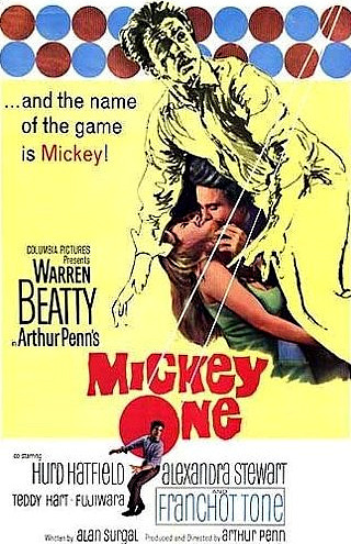
The first thought when I saw this one-sheet this afternoon was how much better it is — more crackling, intriguing — than Arthur Penn‘s 1965 film. I would give this poster at least an 8 or an 8.5, and the film a 5…okay, maybe a 6. What other one-sheets seemed to deliver more than the films they were selling? Nearly all of the Saul Bass one-sheets for those 1950s Otto Preminger films, surely. The Man With The Golden Arm one-sheet is several artistic realms above the movie. Others? There must be dozens.
Here’s part one of the Submarine Channel’s three-week-old interview with main-title designer Kyle Cooper; part two is embedded below. You can argue that Cooper’s most famous contribution to the form is still his main-title sequence for Se7en, although I’m a huge fan also of K.C.’s (and Thomas Cobb‘s) opening credits sequence for John Frankenheimer‘s The Island of Dr. Moreau.
The portion below explains “three classic main titles that made a big impression on Cooper — The Dead Zone(Wayne Fitzgerald), To Kill A Mockingbird (Stephen Frankfurt) and Walk On The Wild Side (Saul Bass). Cooper [also] talks about his credit sequence for Dawn of the Dead, arguably one of his greatest next to Se7en, which was hailed by New York Times Magazine as “one of the most important design innovations of the 1990s.”